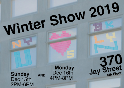
For our composition assignment, we were asked to create a poster for one of ITP’s big semester shows. We were given the information for the 2019 Winter Show to put on our posters and asked to focus more on the people than the tech aspects of ITP.
I decided to highlight the fact the program was in a new location in a couple of ways. Not only did I show the outside of our new building in Brooklyn, but made sure to give a nod to the old Transportation Building by using Helvetica, the font of choice for the MTA’s signage.
For the more decorative parts of card, I decided to go with a Post-Its art style for the center of the design. I felt that the Post-Its art was not only a way of highlighting the creativity of the people who work (and practically live) on the floor, but the message expressed a feeling of appreciation and belonging to our new neighborhood. I also really like how the square shape of the Post-Its resemble the pixels used in much of early tech’s graphics… and even in pixel art today.
The layout for this was fairly easy to do. There’s an inherent grid system in the structure of the building and its windows. I made sure to locate the center of the Post-Its art heart in the very center of the image. I also chose to use different directions for the font based on the type of the information. I decided to format the more “permanent” information, the address and the show that ITP regularly puts on, to go with the lines of the building, almost as if it’s part of the more permanent structure; conversely, I chose to format the information with the dates and times to be squared with the shape of the (more temporary) post card.
Enjoy!