This week for our homework, we worked on creating logos for our personal brand. Back in 2007, I began purchasing web domains. For my personal domain I chose martinSQUARED.com (which I’ve been stylizing with upper and lowercase letters.)
I chose martinSQUARED as people have called me Martin, my last name, since college. My first job out of university, I had to pick a name for my business cards. Interestingly, this company had for many years encouraged people with either 1) similar names to other sales rep or 2) hard to spell/pronounce/remember to use names like “Charlie Brown” and “Alexus Mercedes” as their sales names. This made choosing Martin Martin for my business cards a no-brainer. Thinking back to how people would write A2 rather than Ann Arbor on letters back in college, I signed my name Martin2 on all my letters to customers. (Yes, back then we printed out letters and signed them.)
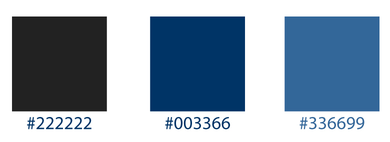
As blue has always been my favorite color—and, fun, related fact, blue-black is my favorite pen color, I decided to go with a range from black (well, dark gray) to a gray-blue to be the primary three colors used in my branding.
The dark gray would be used for headers and the primary text on the site, the navy color in the middle would be used for sub headers, and the third (gray-blue) color will be used for accents and links.
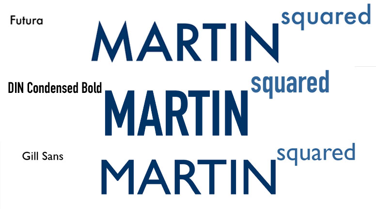
In terms of fonts, I tried several different versions of my domain in different fonts as logos. Previously, I had felt tied to more font-based versions of my domain as a logo, which is why I chose to use upper and lower case to distinguish the words Martin and squared. I had originally used MARTINsquared, but felt martinSQUARED popped more when all text.
Now that I’m designing a logo created as a graphic, I decided to change Martin to all uppercase and make squared lowercase and raise it to be superscript, like the number 2 is in Martin2.
Here are the versions I tried:
In the end, I settled on the font DIN Condensed Bold for the logo and will use Gill Sans for the content. I picked the DIN Condensed Bold for the logo because I like not only how it appeared aesthetically, but I felt the fact that it was more condensed than the other options was a plus, considering how many letters are in MARTINsquared (13.) On that note, I feel like future versions could include a stylized version of my signature (with basically half the letters.)
Here’s the design I landed on:
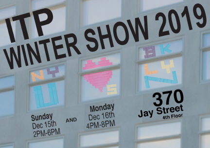
Also, I made some edits to last week’s postcard for the ITP Winter Show. I brought in more windows, used the perspective tools on the words, and changed the font on the Winter Show text.
Here’s the new version: