Project Overview
Over the past few months, as part of our course, we’ve engaged in numerous instructing/learning activities with the aim of better understanding the process learners go through, and, as all learning happens within the learner, how we might go about setting the stage for learners to best do what they do. For my second-half project for Imagination and Distributed Learning, I sought to investigate whether having options in format of how information is displayed creates a more satisfying learning experience for the learner. This was an evolution of ideas using material and concepts we learned about over the course of the semester.
My Idea – Arriving There
As I began to brainstorm ideas for my final project, I looked back on the work I had done for this class during the semester. I started here for a number of reasons, mostly practical, since I had a lot of content already created and had plenty to look over from user testing in terms of feedback. If you’re curious to check out my initial project, check out the link to iOS 14 Tips and Tricks — for Boomers (and anyone who wants to learn a couple neat tricks!)
I then began to think about how I might be able to incorporate this meaty content and information into an idea/concept that’s been on my mind a lot this semester. You see, as someone who has difficulty reading and grew up with a sibling with special needs, I’ve come to appreciate the value of being able to communicate information in varying ways (i.e. explanations using aphorisms, comparisons using infographics, or clarification using annotated images.) I wondered how I could investigate this idea, specifically in the context of this project.
Once I had a preliminary concept, I met with my professor, Clay Shirky, to talk over how I might approach it. I explained that, noting how people—including me—seemed to have preferences in how they take in information, I wanted to create a site that would allow users to select the formats they wanted to see instructional information in by being able to toggle off and on the formats they wanted. The idea was to see which formats people seem to prefer for what types of information and, hopefully, understand better why.
From our discussion, it became apparent that I was likely one step ahead of myself in conceptualizing this. Why not, first, see if this—having options—was even a desirable thing? Clay gave me a few suggestions on how I might want to start reframing this in my mind and, from there, and after a good night’s sleep, I landed on trying to answer the question:
“Does having options in format make the learning experience more satisfying for the user?”
Approach
When I started planning, I thought the main question I’d be asking about more directly was regarding options in format and user/learner satisfaction; however, knowing that 5 is a magic number in user testing and that, if I wanted to have a control group, getting 10 people (5 format options / 5 no format options) to do the testing considering my time constraints would be a challenge. While I hoped I could set up 10 testers, I planned for the alternative.
In overarching phrasing, here was my thinking on that alternative approach: I had a main question (specifically, “Does having options in format make the learning experience more satisfying for the user?”); however, I wasn’t sure how to answer it given constraints (of, mainly, time.) To address this, I picked a couple of areas that I thought I could ask a question in that might help determine, or at least shed some light on, the answer to my main question. In order to answer those ‘sub-questions’, though, those ‘sub-questions’ had ‘sub-questions’ of their own. If you’re having a hard time conceptualizing this, no worries; I explain below.
User Testing Setup
For the record, I got 6 people to do my user testing. Five of the six were ITP-related (one recent graduate, two first-year students, an I&DL classmate, and my Thesis advisor), the other was my 71-year young mother. Of those people, two people (my mother and the recent ITP grad) had done my previous project, from which the content for this project was taken.
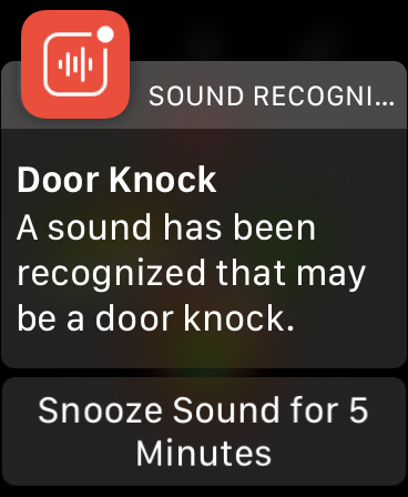
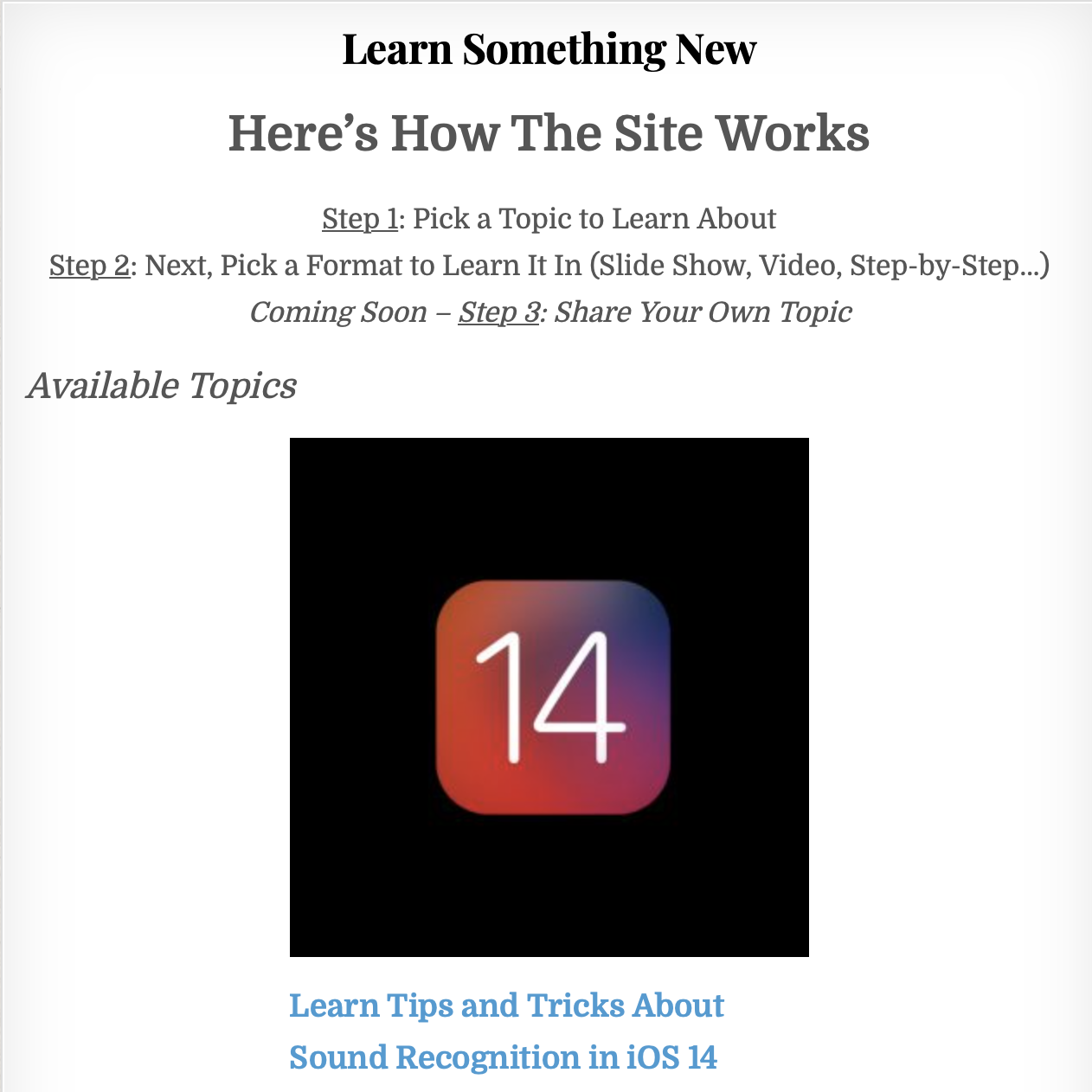
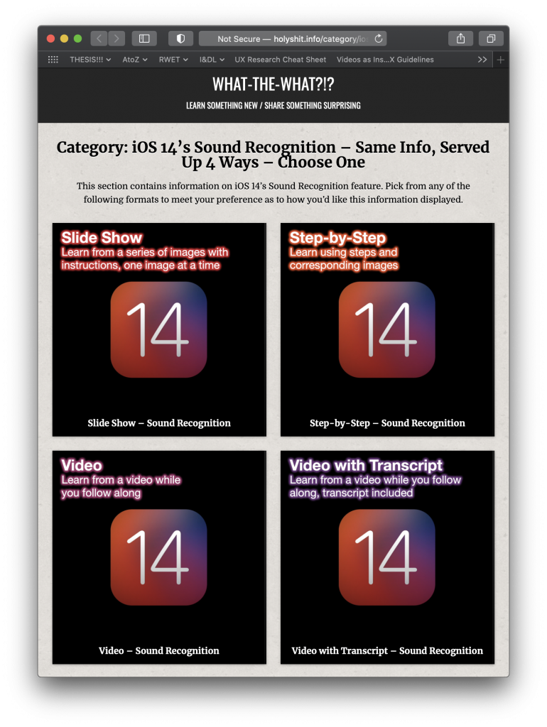
Here’s how I conducted the testing, I created a website that offers different lessons (currently only Sound Recognition in iOS 14) and provides users four different formats to pick from once they select the topic. These formats (individually linked) included “Slide Show”, “Step-by-Step”, “Video”, and “Video with Transcript.” All four of these formats used the same information, just formatted differently (with the exception of transitions to make the information presented read/sound more natural.)
When my use testers started, in terms of the prompt I gave them, I told them that they had heard about Sound Recognition enough to the point that they were interested in learning more. I told them they had done a Google search on Sound Recognition and came across my site. Once on the site, under available topics to learn was Sound Recognition, they were instructed to select it… and I let them go from there. As they went through the site, I asked a number of questions as they proceeded.
Adapting my focus
Elaborating on the alternative approach I mentioned above, rather than focusing directly on the idea of user satisfaction by using a control, then trying to come up with a more ‘decisive’ conclusion supported by comparing many user tests, I decided to use the same user test setup for everyone (using my new site with the format options.) Then, by collecting information through feedback using my sub-questions, I thought I could try to see what I could glean from the responses. This led to long user tests, around 30 to 45 minutes including nice long discussions afterward.
The areas I used to frame my questions in order to try to make inferences on user satisfaction are: Defaults and Modes of Learning.
Testing and Feedback
Defaults
The first area I used to frame questions to probe was Defaults. Specifically, my question was:
So, thinking of the power in defaults, what happens when we remove the default and bestow (or impose) the power to decide?
To investigate this, I asked things like:
- Would you say a site like this would have saved time, taken about the same amount of time, or taken more time than how you usually learn things online?
- Would you say you did or did not get all the information you needed from this format?
- How would you rate your understanding of this topic after reading the article?
In terms of expected or unsurprising feedback from the users:
- They all said this format of having options would save them time.
- They all said they got the information they needed from the format they chose.
- They all said they had a good understanding of the topic after reading the article.
- And, when I asked all of them if they felt not having options or having options was preferable in experiences like these, they all said it was preferable.
As I mentioned, I had two of the people who user tested this time, who’d done my previous project (which gave no options.) I was able to ask them to compare whether or not having options made a difference in their experience. They both agreed it did; they were both people who preferred video format for learning (which the previous experience did not offer.) I asked them if they felt having options this time increased or decreased their satisfaction? Also, unsurprisingly, they said it increased their satisfaction.
Building on that, I feel like I was able to make a little—albeit presumptuous—more headway into answering my question of satisfaction, by taking the responses in context and inferring a conclusion of my own. You see, from the answers given, it’s clear that half of the users would not have been happy with not being given a choice. This is because they emphatically declared their hate for step-by-steps. (Something near-incomprehensible to me.)
At the other end of the spectrum, I had two of the six say they ALWAYS prefer step-by-step. Three of the six say they ALWAYS go to YouTube first, and one was fairly flexible, but preferred step-by-step or slide shows.
From all this, I’d say that it’s likely a safe bet that having options made the experience more satisfying for the user. (Now, there’s plenty more to go on about in terms of how many options, and which options, but from my perspective, this was more ‘in the weeds’ territory than I was going for…)
So, in this instance, with these users, I’d put having options in the “Plus” category in terms of leading to higher satisfaction.
Modes of Learning
The second area I used to frame questions to probe was Modes of Learning. Specifically, my question was:
Does presenting users with options that are framed as “Same Info, Served Up 4 Ways” and starting each description with the word “Learn…”, then forcing the users to pick a format, take them from a more casual learning mode to a more formal learning mode?
IMPORTANT: I want to preface the following by saying this question is built on the idea that when we learn information in more formal learning settings, we’re more likely to retain the information. There is an assumption I’m making here that, given the same information about an interest, learners would be more satisfied if they understood and retained the information, as opposed to not.
To investigate this, I asked things like:
- Do you feel being presented with different ways of taking in the information changed your experience in the way that you took in information?
- Then asking them, “How does it feel different?”
- Did you get what you needed from this?
- And, how would you rate your understanding of this topic after reading the article?
From their answers:
- Most said that having formatting options made it easier to take in, as they had multiple ways to view the information, especially if they didn’t get what they needed from one format.
- They all agreed they got what they needed.
- And everyone said they felt they had a good understanding of the topic after reading the article.
So, from my observations surrounding modes of learning, a ‘conclusion’ on satisfaction based on ease of use and having ‘learned’ is less conclusive than my previous approach, but still feels like it supports—and at the very least, doesn’t go against—the idea that having options increases users’ satisfaction.
A Few More Observations
Here are some things I found that were expected or unsurprising:
-I initially picked iOS 14 as a subject, consciously knowing that Apple’s famous design approaches make the iPhone easy and generally a pleasure to use. I also figured that offering an opportunity to learn about cool new stuff at no extra cost on the device users likely spent a lot of time with would make this process easier. (Users seemed very comfortable navigating their phones.)
-Because of that, I didn’t expect a lot of users to say they felt lost in process or didn’t get anything at all from the experience, and I didn’t hear any of that.
-Also, I assumed that most people would be able to navigate a tutorial site, all—including my 71 year young mother—had no problem, with my quickly constructed site.
In terms of what surprised me and was unexpected here’s what stood out most:
-As comfortable using my site as they were, I was surprised by how much people had to say about my less-than-flashy design choices. It was really interesting, though not what I was looking for in terms of feedback, but I appreciated hearing about all the design choices that I didn’t have time to make. Things I am sure I would not have thought about until much further along in the design process. Even when I revealed what I was going for after asking all my questions, hoping to get some higher-level feedback, I still got very detailed design feedback.
-Also, I feel like I’m a fairly particular person, so I guess it surprised me when basically everyone else seemed to have as strong preferences in format as I did. I guess I just assumed people were more roll-with-the-punches than they are… at least when it comes to learning online—apparently, not!
Reflection
As I mentioned above, looking at the question of user satisfaction when it comes to having options in formatting, I had to attack my main question by looking more closely at related areas. Specifically, I used the lenses of ‘defaults’ and ‘modes of learning’ to try to answer this and felt, in the end, that, yes, having options in format does have a positive effect on learners’ satisfaction.
Calling to me are the adamant voices of the people I interviewed after user testing, declaring that they definitely have strong preferences (well, five of six) when it comes to formatting of material in learning. The simple of it is that having more options increases the likelihood that a learners’ preferred format will be available as a learning tool. Adding to that is the fact that all of the learners retained the information when they used their preferred format. While I cannot assume that the users would not remember the information if presented another way, I can assume that remembering the information is a positive thing that likely leads to higher satisfaction in the learning process.
I enjoyed getting all the feedback, not just from my use testers, but also from those present at the presentation I made on my research last week. In particular, I appreciated the feedback that suggested including having the ability to change between formats within a lesson as needed. It’s interesting because that idea is very much in the vein of what I had initially conceived for the project; in fact, where I would consider this iteration of the project a step back from my initial thought, I would consider this feedback a step forward from my original idea.
Additionally, I’ll say that I also really appreciated the feedback regarding my user testing. I’d really hoped for more sources of feedback and was surprised by how well received the fact that I had done user research on such a small number of testers. After hearing how well-received my six testers was—and from people with much more experience with the user testing process, no less—I feel more confident in my observations and about taking on such testing in the future. (To those present at that presentation, thank you!)
Next Steps
As far as next steps go, my first thought is to re-do the testing with more testers and have a control group. That would be the most logical, direct approach in terms of next steps. That said, with a control group, I would want to reframe my approach, likely asking more direct questions about satisfaction levels to be able to compare between groups. Also, one of the best pieces of feedback I got was a suggestion of having a “Recommended” or “Popular” tag on the formatted options for people who might have a hard time choosing. I’d be curious to test this out and see what kind of impact that might have on the process and users’ satisfaction.
Finally, one of the pieces of feedback that made me (and the tester) feel as though there was a bit of a contradiction was, when asked if they felt like being presented with different ways of taking in the information changed their experience in the way that they took in information, the tester said, “No.” …because they didn’t need options since they “have a way that works best” for them, and that they would have found that format (video) had it not been listed. At the same time, when I later asked if they felt “having options this time increased or decreased [their] satisfaction?” They were very sure it increased their satisfaction.
It leaves me asking “What’s in there? What’s at the crux of what sounds like a contradiction?” This would be another area I feel worth investigating moving forward!