For this assignment, we were asked to implement the ideas we came up with in the previous weeks. For me, that meant designing two independent learning opportunities for the same topic; specifically, I chose tips and tricks for iOS 14 for my topic and implemented these opportunities two ways: over FaceTime (first method) and via WordPress blogpost with writing and pictures (second method.)
The idea of using iOS 14 as the subject for my topic came to me quite easily as this iPhone update had just been officially released—finally—the week we picked the focus of our projects. I’d been reading and learning about the few features to be included in iOS 14 for months now and thought this would be a good opportunity to show some people in my life how to upgrade their digital ones… at least the ones who have iPhones. I’ve been an iPhone user for over a decade, so I’m very familiar with its operating system; the fact that Apple and its employees have spent vast quantities of time, energy, and money in designing an operating system people will want to use also made this an attractive topic for this project.
To prepare for the FaceTime sessions, I looked back through the new iOS 14 features to pick a few for the lesson. To focus each process and help the session flow more easily, I sketched out an outline that served as an agenda. Having experience leading training sessions (as well as a background in sales and marketing), I know that how you present the learning opportunity can affect the participants’ takeaways. Because of this, I settled on a “two little things and a ‘big’ thing” format. (The ‘big’ thing is a play on words as it involves placing Widgets on your Home Screen and, appropriately, Widgets allow you to place icons that are bigger than what was previously allowed.)
I picked the ‘things’ in the newest iOS which would be the focus of the FaceTime calls by thinking of my mother (I’m not allowed to say her age, but let’s just say she’s been ticking the “65+” box on forms for a while now) and referred to it as a “Tips and Tricks” session to make it sound structured but casual. For my two small things, I picked an introduction to the App Library (a new view of your apps, all in one place) and a short walk-through of how to turn on the Sound Recognition feature. For my big thing, I chose to show the participants how to get started with Widgets by showing them how to find, select, place, and customize them.
I arranged the progression of these demos within each session so that I would start with the most ‘closed’ thing—here, I mean the thing which required the least customization and exploration—and end with the most ‘open’ thing—which would leave the participant 1) having recently placed a new, highly-customizable feature and 2)with the knowhow to place more (and more!) to continue on the learning opportunity after the session.
From my notes, the overarching structure I plotted for the sessions is as follows:
- Welcome and thank the user.
- Make sure user has installed iOS 14.
- LittleThing1: App Library (ask user to swipe from right to left to get to the end and reveal the App Library.) Tour it.
- LittleThing2: Sound Recognition. How to:
- find it,
- turn it on, &
- customize it.
- BIGThing: Home Screen Widget. Steps:
- Mention Widgets existed in iOS 13 if you swiped left from the Home Screen,
- Have user enter “jiggly mode”,
- Tap “+” in upper left order,
- Pick a Widget and place it, &
- Play with it and tap to customize in jiggly mode.
- Get Feedback
As far as my second approach (WordPress blogpost), fortunately, having done all the above work to prepare for my first approach (FaceTime), I essentially was left having to flesh out the specifics of the content between the scaffolding of my outline. Having already facilitated my first FaceTime call before writing the WordPress blogpost, I had a good idea of what info I needed to include.
In addition to writing out the content, I also needed to create and upload a number of image assets to provide additional content to compliment the words in the post, keep the learner interested, and prevent the over-saturation of text on the screen. I made the intentional choice of NOT screen capturing and annotating each screen for each step in the process out of concern it might seem like a big time ask if the learner’s first impression is that there are dozens of images, each with steps that will need to be followed. I did expect to hear people asking for more images, but thought it worth it to go the route of having fewer images highlighting important/attractive aspects of the activities.
As of this writing, I was able to get 5 people to do a FaceTime session (first method) with me (over 4 sessions); of these, three were boomers and two were in their late 20s. I have been able to get 6 people to try out the learning opportunity I created via WordPress blogpost (second method). I’m still waiting for feedback from a couple of the users testing my second method, the blogpost. (I’ll update this article with any interesting new info that adds to this post should it come in.)
Obviously, one of the biggest advantages to carrying out this semi-informal experiment over FaceTime was that I could get immediate feedback from the user—especially helpful when it came to getting assessments of the activities at the end. The feedback for this method was overwhelmingly positive with people saying things like they felt the info was very useful, they appreciated me taking the time to show and explain these new things to them, and even that they’d never had someone walk them through features on a device like this.
To be fair, my professional background is in inside sales and, in my last job, I was the marketing and e-commerce manager for a large independent company, so I have lots of practice remotely guiding people through technical activities; I wasn’t expecting much negative feedback and, fortunately, didn’t get much. The closest thing I got along those lines was that I “should just write it down and put it online so I only have to do it once.” (I took that as more of a pragmatic-themed comment than a critique of how to best spend time with me and my ideas.) I was pleased that the work I’d put into thinking about the details of the activity ahead of time paid off.
For the WordPress blogpost, the reactions were a lot more varied. The comments I got on it ranged from “I liked the fun, casual tone of your writing” and appreciation for the content, flow, and text-to-image ratios… to more critical ones suggesting I include more images, provide greater clarity surrounding terms related to iOS, and make the process a longer, numbered list of steps instead of mixing steps and paragraphs. I can definitely appreciate the feedback both positive and negative and much of it was on things I had made conscious decisions on previously.
Because of its nature as a document existing online, if I had to pick a task/tool pair to further invest in, I would pick this blog version of the topic to continue working on. Having received such detailed feedback, I’d likely include some form of those suggestions in my next iterations of this process. Specifically, I feel like adding more images as visual checkpoints would be useful. I’d add them between steps and possibly edit a few images, adding arrows/circles/boxes to indicate to learners where on the screen to look. I also think including links to important terminology could be a useful/used feature of the updated blogpost.
As other members of the class looked for testers and feedback last week, I figured I’d make a few deposits in the “good karma” bank and help some of them out. The one that stands out to me the most that I feel like I can borrow from is one on how to make Mary-nara, which, to quote the author, Mary, is the “best and easiest” way to make marinara. The page has a clean black-font-on-white-background design that uses underlining, bolding, and italicizing—rather than images—to break up the text and emphasize different aspects of the recipe’s process. Unlike my blogpost, there are no images at all, in fact, but they don’t particularly feel lacking. This aspect did draw attention to the importance of descriptive ‘status’ checkins to help keep the learner confidently on-track. I enjoyed Mary’s tutorial’s causal tone, super appropriate for such a recipe. I especially appreciate how she helps guide the learner with pieces like, “If you’re not sure how much spice you like, try this:…”
In terms of my project, in the end, there weren’t any big shockers in my feedback, though I did find a few things interesting. To name one of those, I was surprised that the most technically inclined people I gave FaceTime walkthroughs to seemed to be the ones least oriented with the Settings panel on their iPhones. I’m not sure why that is, but, knowing these testers on a personal level, I’m guessing it has something to do with a utilitarian mindset—meaning they have an idea of what’s possible with technology and have sought out and learned about those which they most felt they needed. (Think on a mission, as opposed to wandering exploration.)
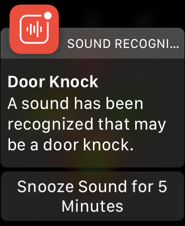
Additionally, these tech-minded people also seemed to be the ones most surprised and impressed by the Sound Recognition feature, which, once enabled, will alert you to environmental sounds (within range of your iPhone’s microphone) such as fire/smoke alarms, barking dogs, and knocks at the door. To me, this also makes a bit of sense seeing that those less technically inclined often aren’t aware of such new trends and innovations in technology.
One other small, but significant note I made to myself while doing the FaceTime sessions was, “[Should have added: Ask the user to start on the Home Screen.]” This was me catching myself in something that I actually worked really hard on addressing—making sure that I created a continuous flow by not leaving out information or by making too many assumptions in terms of the participant’s setup, understanding, or place in the process. I feel like this is something that’s easier to catch when written out; however, I found myself having to say, “Yes, sorry. From the Home Screen, again” several times on the FaceTime calls. That just goes to show how valuable user testing is in processes like these!
Were I have to choose one as more superior to the other, I would reluctantly pick the FaceTime implementation; this is based on the fact that, considering this would be an exercise designed for the learner, this method places a great amount of attention on guiding and accommodating the learner. Additionally, not only am I well equipped to conduct these sessions, but the ability to get immediate feedback and address it immediately makes this a very effective way to learn.
There are tradeoffs though, and if this were only about the teacher, the blogpost would be the superior method. One-on-one sessions, especially with trained individuals, are expensive—both time and resource-wise. As one of my testers commented, making a document would entail just making it once and allowing the learners to access it when they want—without me having to do the work again. Ultimately, the answer is about finding that place on the spectrum that balances what works best for the learner and what can be afforded by both the teacher and the medium in which the learning opportunity is presented.
If you’re curious, here are some of the conscious decisions I made in the design process:
—using an operating system as a subject, something that prospective participants would already be at least somewhat familiar with
—gearing my sessions toward ‘boomers’ (essentially, implying a low level of technical skill needed to follow along and allowing for a greater pool of prospective participants
—choosing features (aka tips and tricks) that are functional, interesting, and useful
—making sure to emphasize not just features, but potential benefits
—having an outline structure for the call/blogpost to help with focus and flow
—implementing a casual tone in both spoken and written word
—posturing as tips and tricks and structuring as two little and one big thing
—trying to keep the opportunities attractive to the participants by keeping jargon and other potential overwhelming scenarios (i.e. long periods of me talking or writing instructions without variation) to a minimum
—starting with the most ‘closed’ feature (a guided tour) and ending with most ‘open’ feature (a Widget that can continue to be edited after the session)
———o———
Also, before starting the testing, I made a list of pros and cons for each method. Here’s how the lists broke down:
———FIRST METHOD: FaceTime———
Pros
- Being able to ask questions when they aren’t sure of how to proceed or if they get lost and get immediate feedback.
- It’s current; not like my blog post will likely be in two years.
- Also, content-wise, Apple already puts ALL the work into designing a great experience in your hand.
- Fun to learn. Opportunity to enhance productivity with no cost.
- Bottom line: To iPhone owners, it’s an easy sell.
Cons
- Having to go through the steps in order.
- In a way, limiting the range of what’s on the table (but could possibly what they want.)
- Guiding discussions back to an agenda when non-related questions come up, for some, could cause friction in flow—with live, one-on-one conversations, that’s always a potential hard aspect to address.
- Social awkwardness / language issues (technical and otherwise)
- Also, potential for internet connection and scheduling issues/can’t just stop and come back later, as well as noise (background noises, family interruptions)
——SECOND METHOD: WordPress Blogpost (words + images)——
Pros
- Steps are listed in order and are given visual hints (ie. there’s a blue square with a little white person in it next to the option.)
- Interruptible and can skip around.
- Written casually and in a familiar format, using simple feature-benefit wording.
- Limited to relevant, attention-getting images (not tons of pics of overwhelming settings screens.)
- Mix of steps and paragraphs for flow
- Can likely tell whether this would be a good use of their time
- Easily identifiable sections give you a heads-up of what’s next and make it a cinch to find what you want.
- Ability to leave comments, if they have questions.
- A delightful sense of humor peppered in always mixes it up.
- Written to speak to a specific audience (but not restrictive)
- Also, the Apple thing (see 1st task, easy)
Cons
- Having to read the steps.
- More words than images (to keep focus/flow, but may read as boring/sparse)
- Inability for immediate feedback
- Will eventually be dated, (not the humor, though.)
- Can’t be soothed if insecure about abilities to complete tasks (maybe think it will be too hard, like the VCR.)
- Opportunities for abandonment midway/hitting do-not-pass-go roadblocks
If you do decide to checkout my WordPress blogpost experience for tips and tricks for iOS 14, I would love to know your feedback on it! Feel free to leave comments in the section below the content.