This week, we were asked to check out different styles of maps for inspiration and continuing with creating maps and working on our projects. After doing the readings and reviewing the maps, I decided that I wanted to try creating a couple different types of maps for my project. As you will see, things didn’t turn out exactly as planned. Fortunately, there is a variety of tools available for map enthusiasts and techies of all levels.
I started by checking out the example maps and deciding I wanted to:
- create a map that would show what a subway desert would look like for someone with accessibility needs
- recreate the subway desert maps that includes all ADA compliant and non-compliant entrances (to match the style of my first map)
- create a map showing of some kind of demographic(s) for the maps (i.e. accessibility needs / poverty) using hexagonal mapping (as many similar maps I’ve found appear to use zip code.)
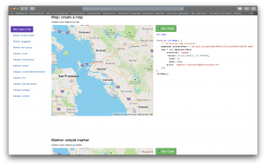
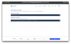
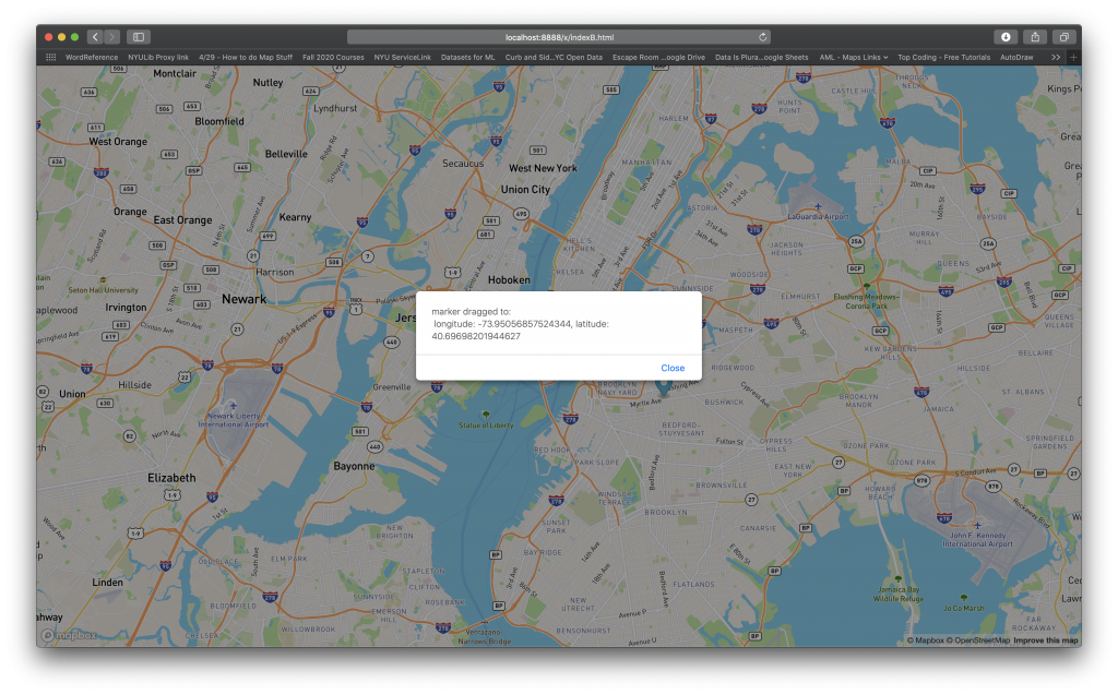
In doing this, I checked out the Sandboxes for Turf and Mapbox; however, being relatively new to coding javascript, I wasn’t sure how to access/use these scripts (and, to be honestly, I wasn’t even completely sure that the code was ‘pure’ javascript enough that I could get it to work.) Several hours later, I had not only successfully loaded a map and figured out how to add a movable marker (yes!), I had convinced my javascript coder boyfriend to come take a look at the code the next day.
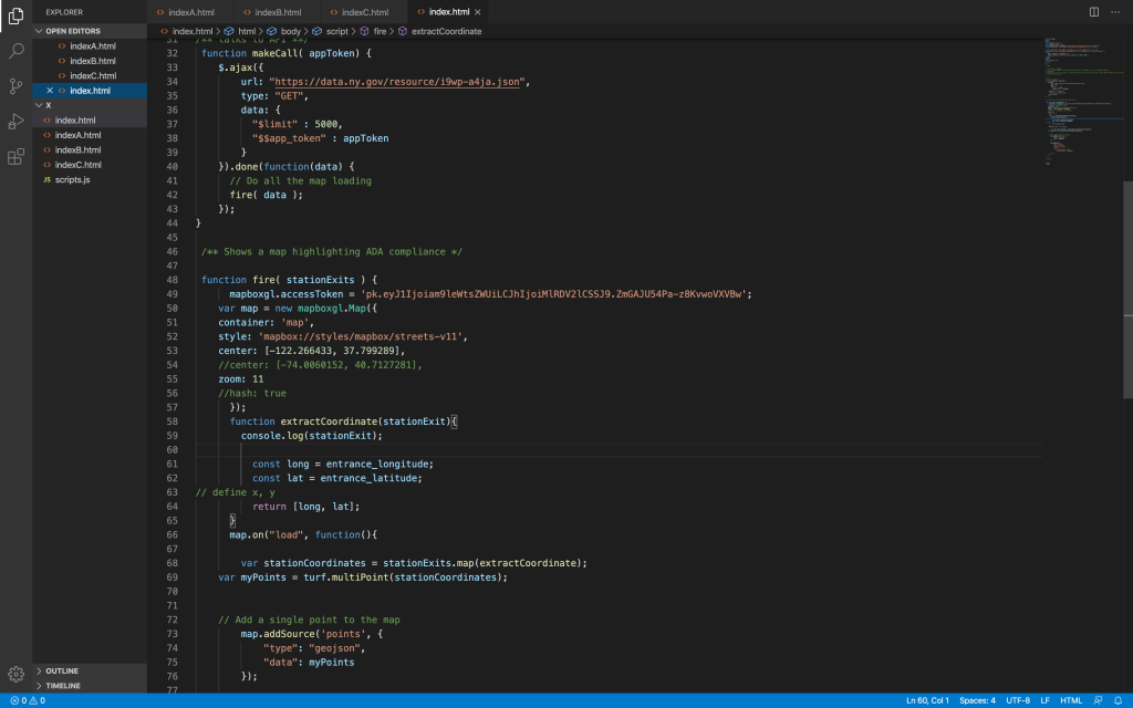
Unfortunately, when my boyfriend came over, we only had a couple of hours for him to teach me a few things before I had my next group meeting for another final project. We spent just over two hours going through what it was I wanted to do, the code I had written the night before, and the different parts of the code snippets for Mapbox. I was hoping that he could show me how to easily load the latitude and longitude info into my map; this lead us down the path of looking into the data I was planning to use. Once we got to looking at the NYC OpenData dataset I couldn’t find what I wanted. Through a Google search, I ended up coming across Open NY, the State of New York’s data portal. (Fact: The MTA is actually owned by the State of New York, a fact not many outside the area know; so, the data for the MTA stations could be found on Open NY, rather than NYC OpenData.) I chose to work with (“NYC Transit Subway Entrance And Exit Data”), my boyfriend suggested it might be better to see if Open NY has an API we could use.
We spent a very long time trying to get this sorted out and for him to get his bearings on what all the settings and documentation meant, and were able to get me set up with an API token. Unfortunately, there just wasn’t enough time to go through all the documentation and teach me how use it within a short amount of time. (He probably could have done it for me, but that doesn’t give me the experience I’m taking this class for.) I did get a good ways into the code for using the Open NY API, but not nearly far enough to use for this project.
With all this in mind, I’m further realizing that, especially after last week’s assignment, rather than this class serving the purpose of me learning a lot about map producing techniques (which I have, theory-wise), how to make them, and using this to make a meaningful, impactful project, I should use it to gain experience producing maps within the frameworks I’m comfortable with. While I’d really like to push myself with deep, boundary-pushing issues and complicated mapping projects, I feel I’ll get the most from this class by continuing to do the readings (which, more than expose me to new ideas, is furthering my understanding and perspectives on what defines things) and finding datasets on issues with are deeply personal and making visual representations of those.
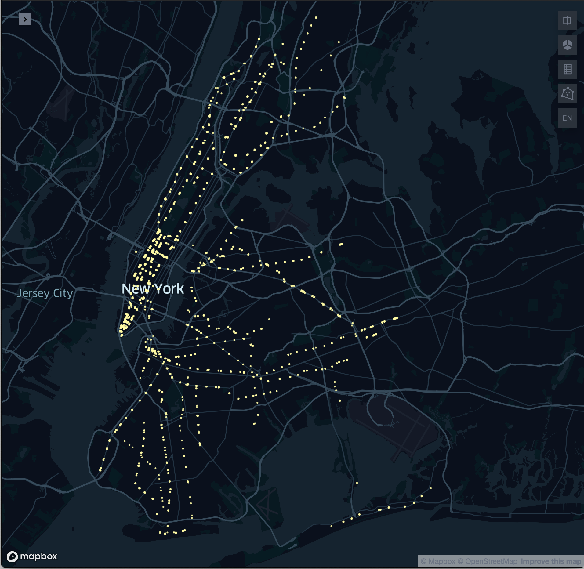
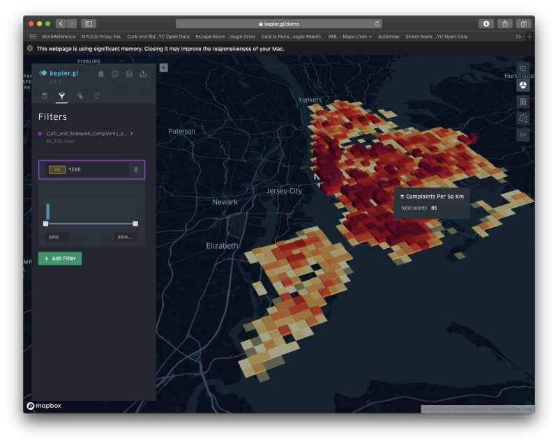
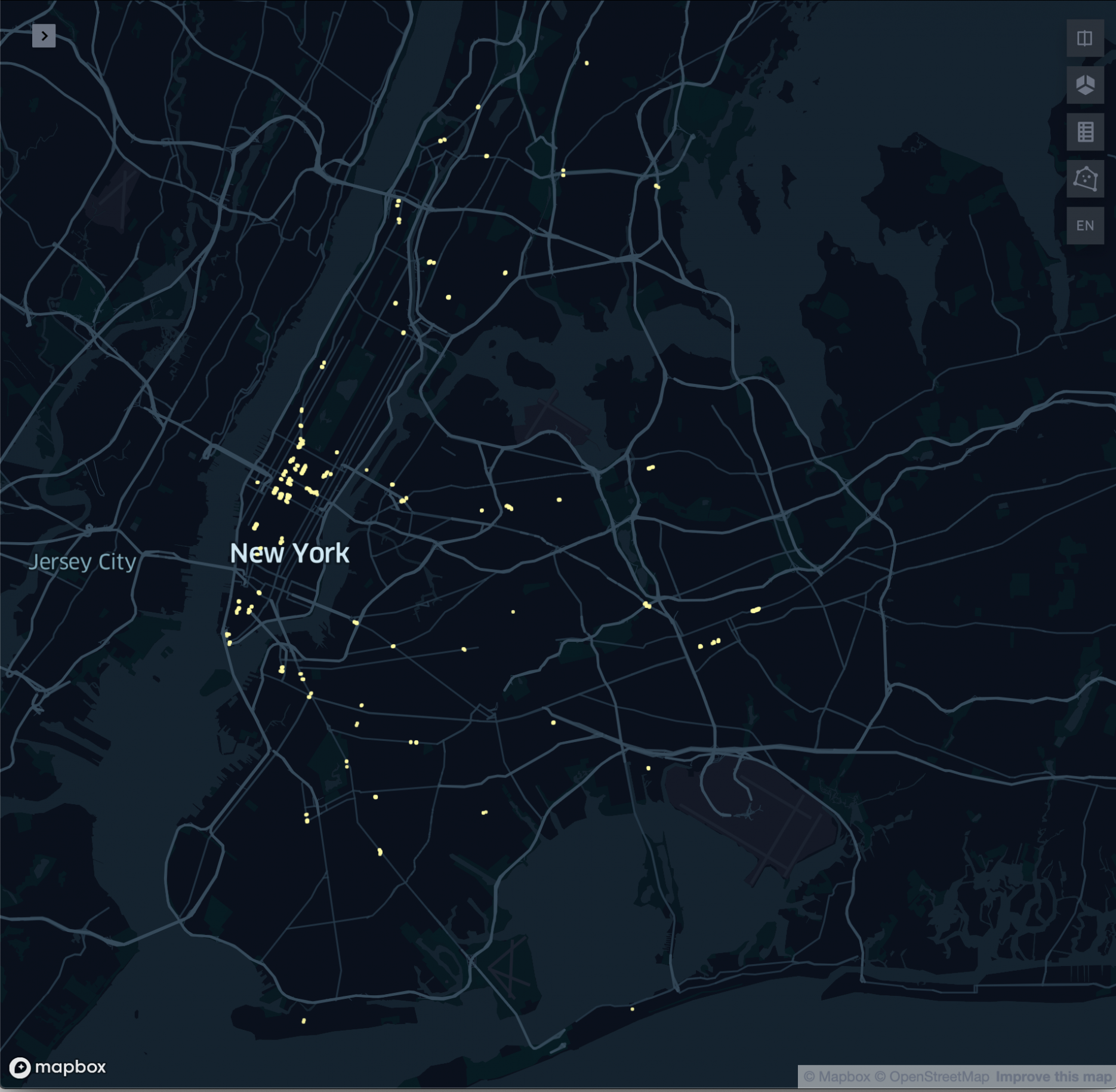
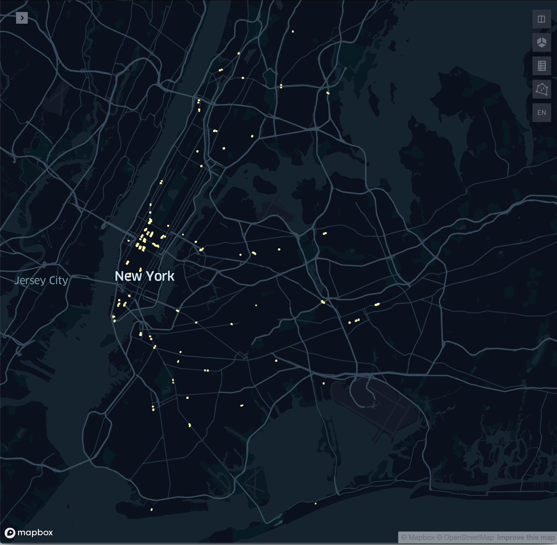
So, here’s what I’ve come up with for this week, I’ve created two maps (which are actually just one map with a filter applied), using Kepler.gl. I had a number of issues getting the data to load (at first I thought the site was down), but found that Kepler.gl didn’t like the column headers I was using. In the end, one version of the map shows the NYC area with all of the MTA entrances/exits and the other shows the map with only ADA-compliant station entrances/exits. I tried making it so that it showed a half-mile distance around the station entrance/exit, but found that the dots didn’t retain their proportion when zoomed in and out (so not really sure what the pixel size settings of the dots means.)
For next week, I’d like to look into doing some hexagonal grid maps of data relevant to this project that has previously been most prominently displayed by zip code.