This week, in addition to our readings, we were tasked with trying out a few different mapping applications that will allow us to choropleth mapping. (For those unfamiliar, here’s what choropleth mapping is. You’ve seen it around, even if you didn’t know its name.)
Last week, we checked out the Kepler.gl website and this week, in addition to creating a Kepler.gl map, we were asked to work with Datawrapper.de and Leafletjs.
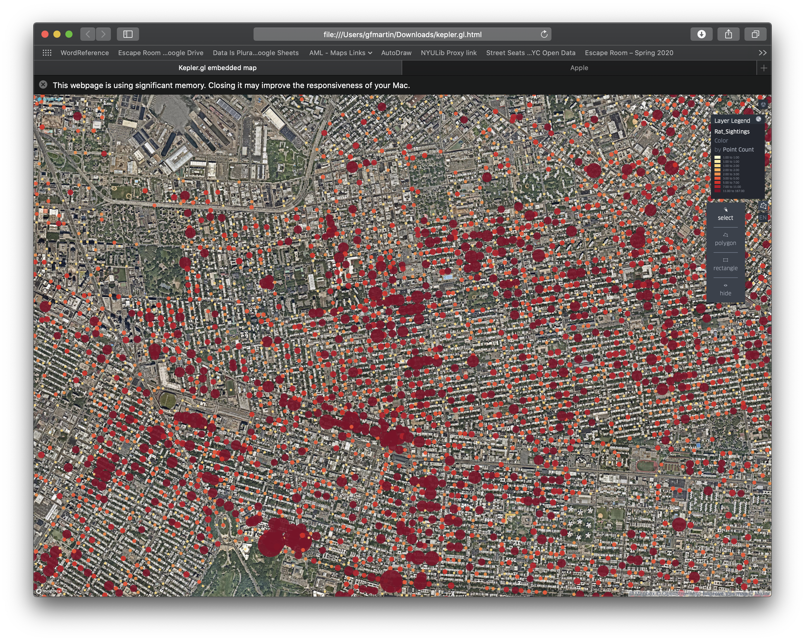
I started off trying to use the dataset included in the class materials so that I could quickly get going on these projects. (For the record, at this point, I’ve spent over 4 hours playing around with these maps and data sets–by far, the majority of my time has been spent searching for, downloading, cleaning, and sorting the data… as well as waiting for my computer to process it all.) My browser downloaded the 2019 rat info as a txt file and when I removed the “.txt” at the end, I still had problems.
To get around this, I went ahead and downloaded the data from NYC OpenData. The data I downloaded was from 2010 until April 2020. Because of this, I found Kepler.gl giving me massive problems–taking forever and crashing.
After an hour or so of waiting around on Kepler.gl to process my data, I couldn’t take the spinning wheel of death anymore and decided to pick things back up again another day.
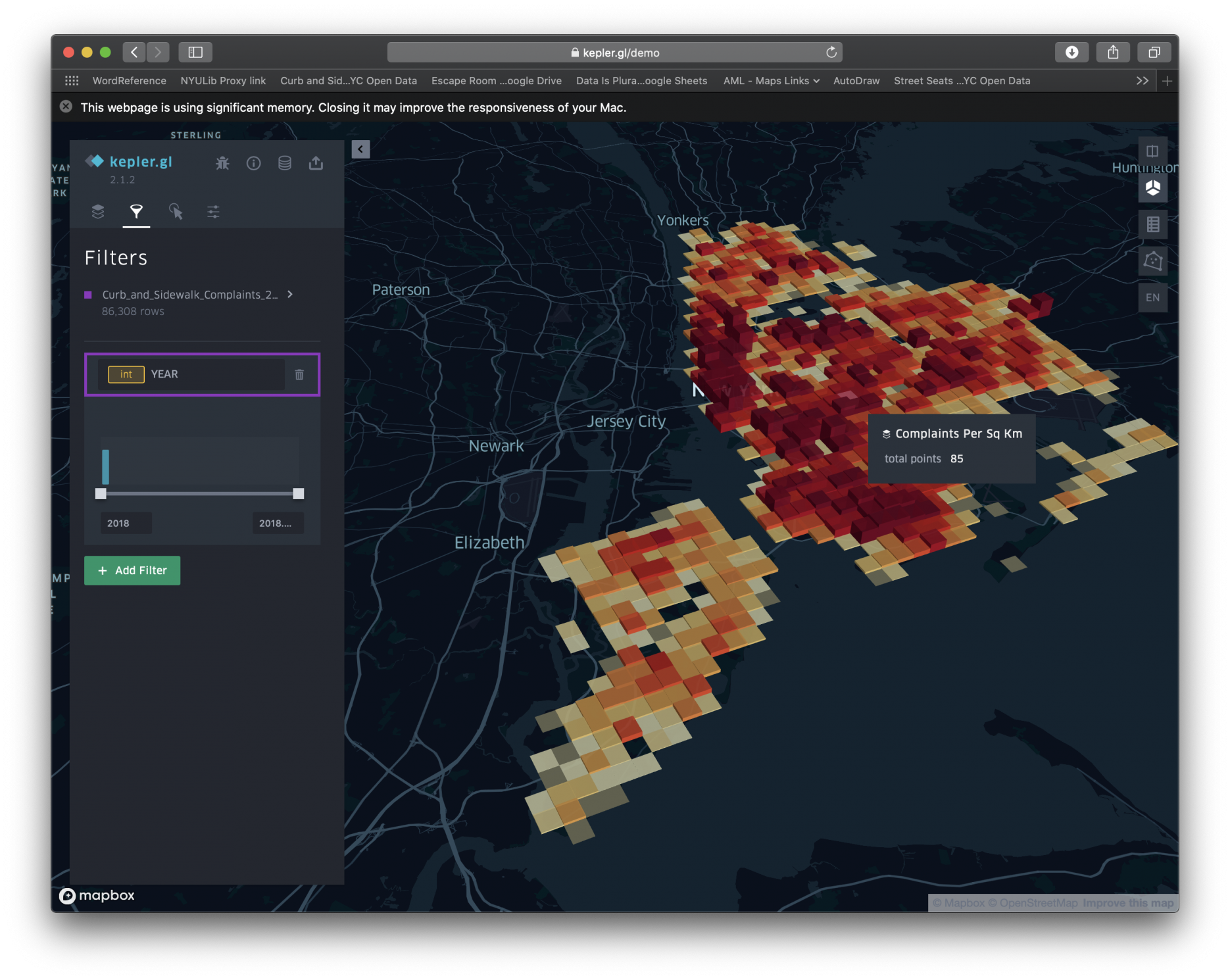
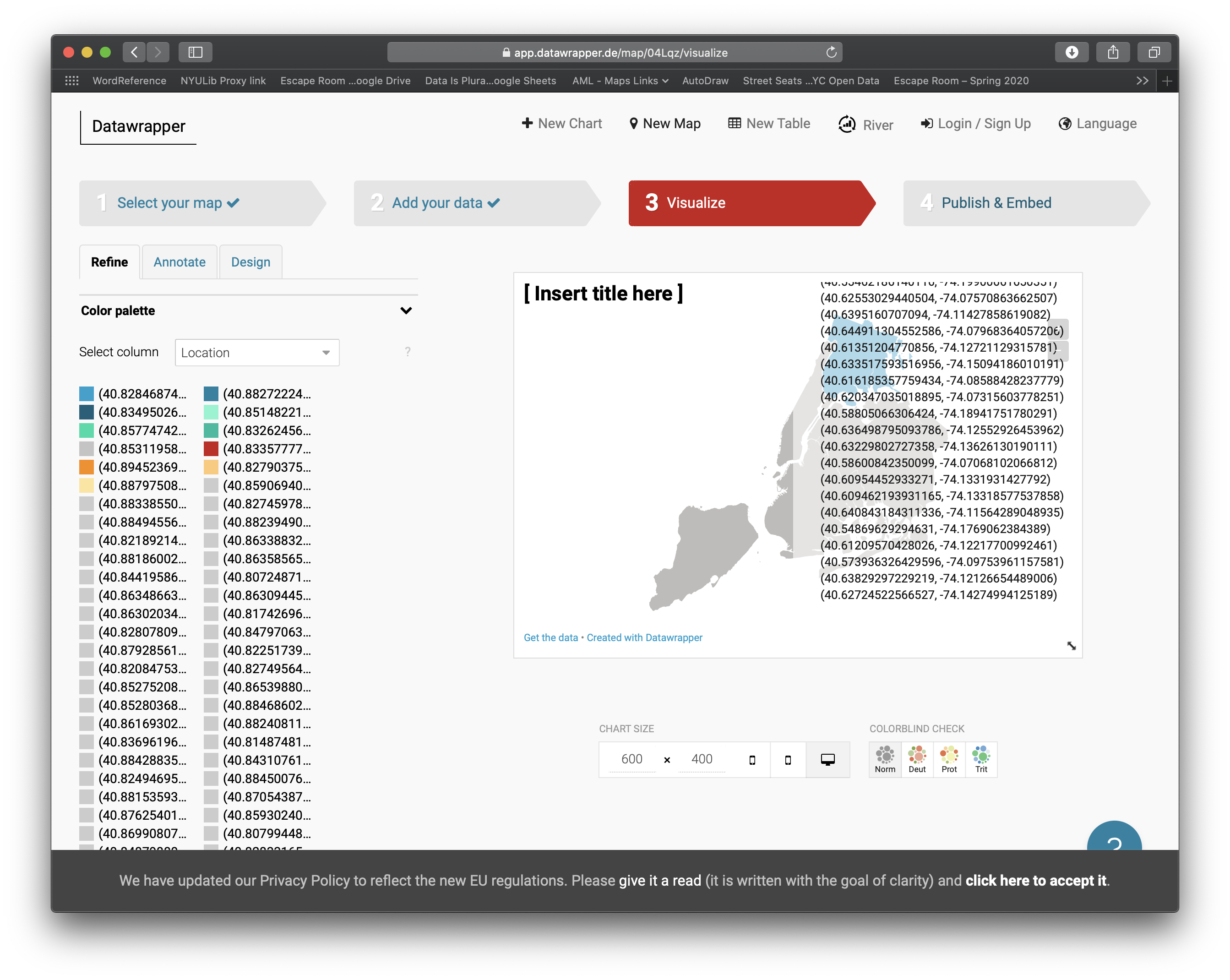
I started playing around with Datawrapper.de. I kept running into formatting issues and getting frustrated with the errors I kept getting. I decided that I would find data that was more relevant to my Final Project if I was going to go through all the work! I ended up downloading a list of Curb and Sidewalk Complaints from NYC OpenData.
I didn’t realize that, unlike the data in Kepler.gl, the data you submit to Datawrapper.de works best if you process it and upload only the info you know you’re planning to use (rather than upload it and have the program aggregate and map it for you.)
I created a pivot table to get a count of complaints per ZIP code. The ZIP codes Datawrapper.de told me were unaccounted for, I added to the dataset with 0 complaints listed.
Here’s what I came up with using Datawrapper.de in terms of a map:
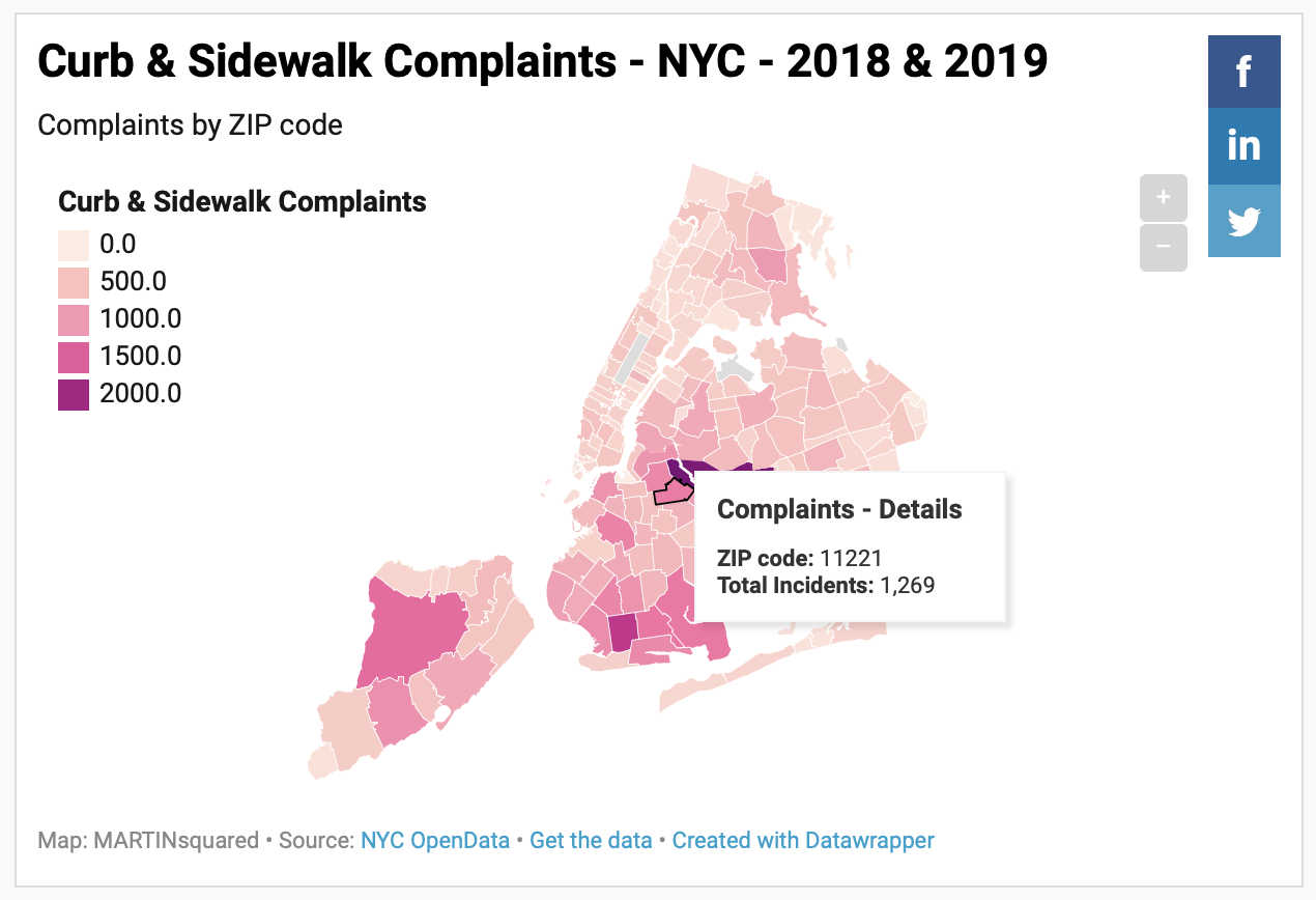
The data for the map above only included the ZIP code and the number of complaints in 2018 and 2019 combined. Once I figured out how to upload the data to give it what it needed, I really liked the results of the Datawrapper.de map.
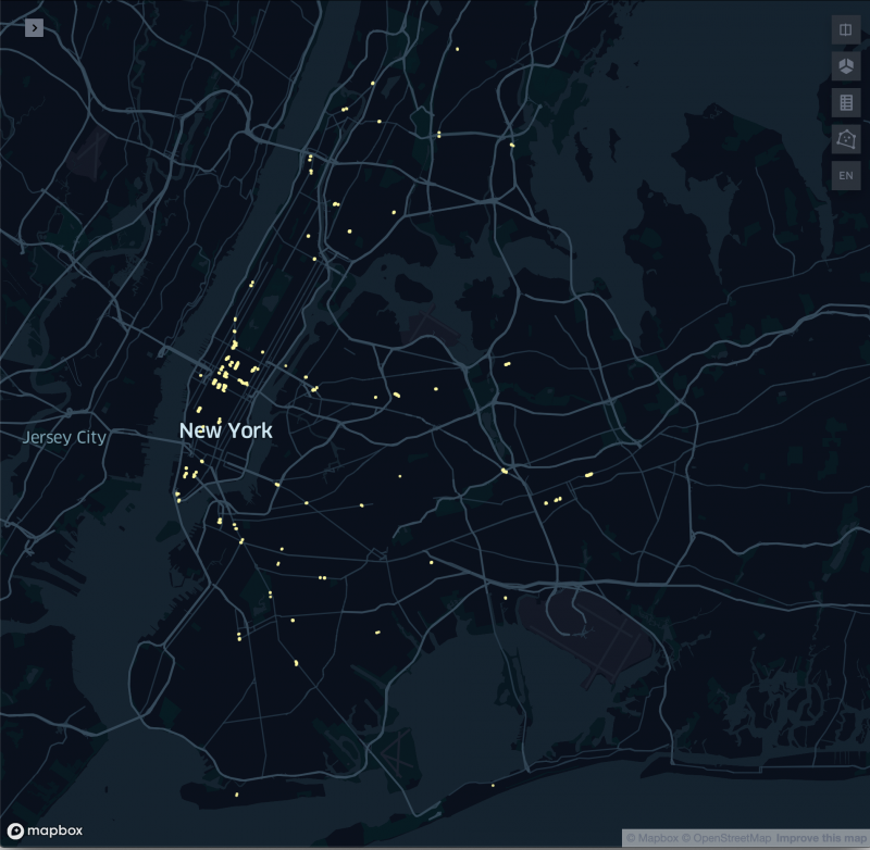
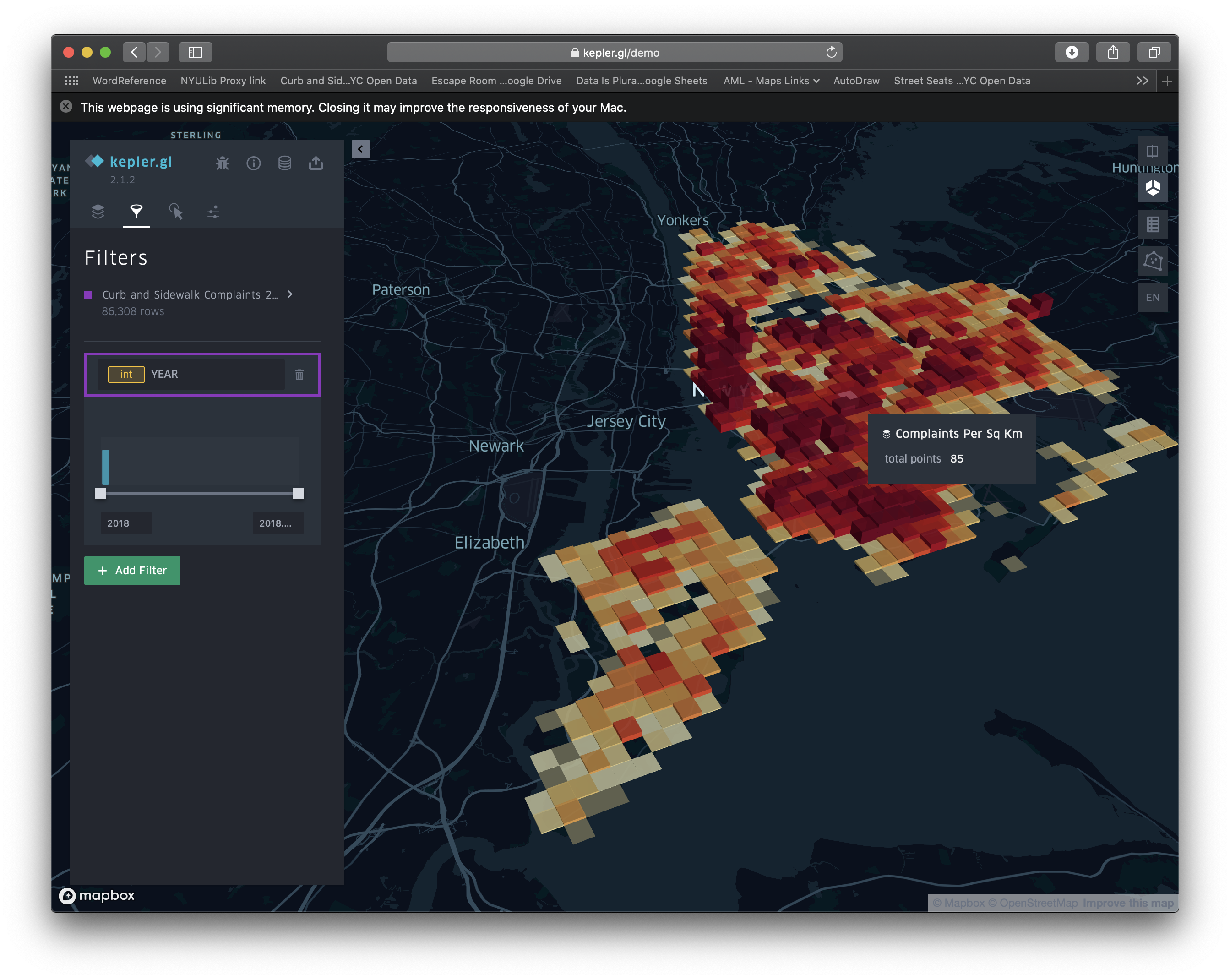
After massaging and formatting the data a bit, I decided I’d try using the Curb and Sidewalk Complaint info I used for the Datawrapper.de map in Kepler.gl. I found that the 2 column data was inadequate to make a map with Kepler.gl, so I uploaded the source data I used to make the pivot table for the Datawrapper.de choropleth map–which had fewer rows and columns than the original data set, but more than the pivot table I uploaded to Datawrapper.de.
Here’s what that data looks in Kepler.gl. Cool, huh?
Having successfully completed the first two mapping choropleth mapping projects, I was looking forward to checking out the Leaflet.js stuff, especially after watching the 40-minute video talk by Vladimir Agafonkin from the reading section this week. Unfortunately, I had serious problems getting through the tutorials.
I double checked my work and went back over the Boston tutorial, but, no luck. Considering my js skills are weak and, with all the work I have on my plate with finals coming up, I won’t likely be using this platform anytime soon (at least until I get more comfortable with JavaScript.) I did try, but the farthest I got was this:
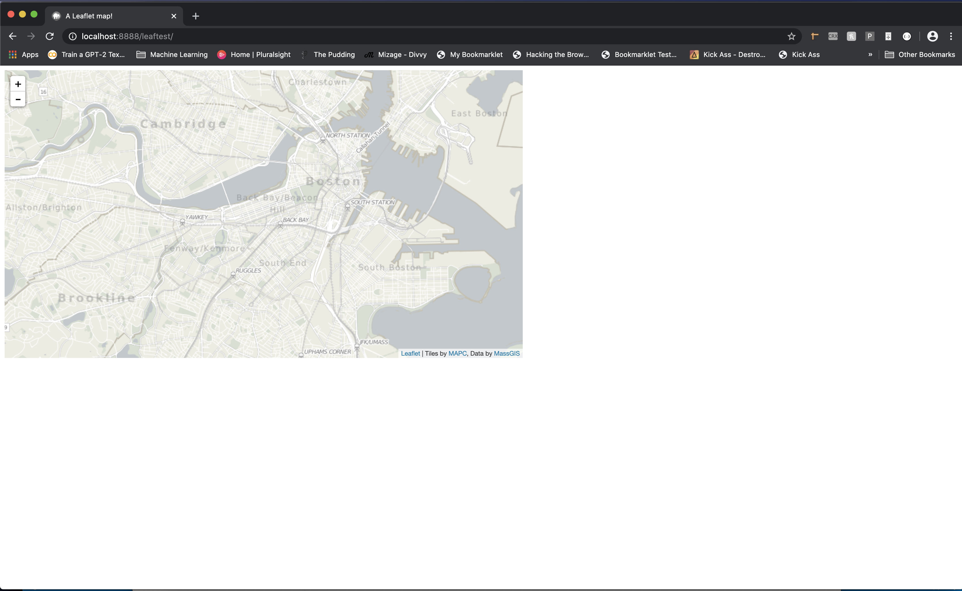
Getting the map to show up and seeing the code and the file structure used, it reinforces the fact that these maps are compiled in layers that allow you to add data to an existing map.
While I definitely ended up more frustrated than not with trying to make these maps come together, I think it was a good reminded of how much work, planning, and thought goes into preparing and producing such maps. The awesome part of this is that there are open-source tools available with lots of functionality to bring the data to life!